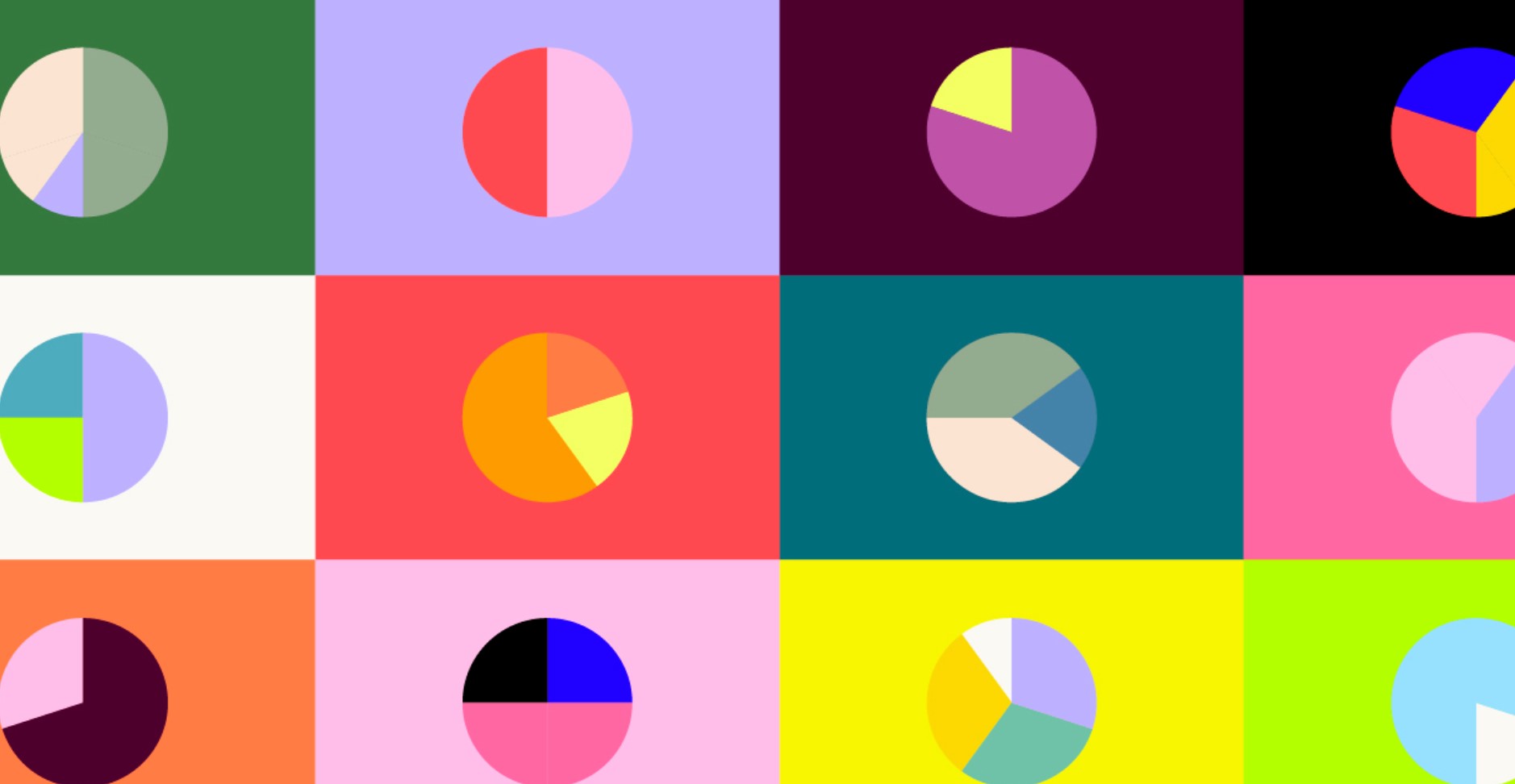
Exploring Different Color Palettes for Background Website Design
When designing a website, selecting the right color palette for the background is crucial. The background color sets the tone and creates the foundation for the entire visual design. It’s essential to choose colors that complement the overall theme and purpose of the website while ensuring readability and user engagement.
Importance of Color in Website Design
Colors evoke emotions and can influence how visitors perceive and interact with a website. They can convey different moods, establish brand identity, and enhance the user experience. When used strategically, colors can capture attention, guide users through the content, and create a cohesive and memorable browsing experience.
Harmonious Color Palettes
Harmonious color palettes are a popular choice in website design due to their ability to create a cohesive and visually pleasing look. These palettes use colors that work well together, resulting in a harmonious and balanced design. Here are three types of harmonious color palettes commonly used in website design:
- Monochromatic Color Palette
- Consists of variations of a single color.
- Creates a harmonious and elegant look.
- Adjusting the saturation and brightness adds depth and contrast to the design.
- Analogous Color Palette
- Combines colors that are adjacent to each other on the color wheel.
- Offers a cohesive and pleasing effect.
- Allows for subtle variations while maintaining harmony.
- Complementary Color Palette
- Combines colors that are opposite to each other on the color wheel.
- Creates a vibrant and eye-catching design.
- Careful use of complementary colors is essential to maintain balance and readability.
When using harmonious color palettes, it’s important to consider the overall theme and purpose of the website. The chosen colors should align with the brand identity and evoke the desired emotions in the target audience. Experimenting with different shades, tones, and saturation levels within the chosen color palette can add depth and interest to the design.
In conclusion, harmonious color palettes offer a visually pleasing and balanced approach to website design. Whether you opt for a monochromatic, analogous, or complementary color palette, each choice brings its unique charm and appeal. By carefully selecting and combining colors within these palettes, you can create a harmonious and engaging website design that captivates your audience.
Contrasting Color Palettes
Triadic Color Palette
A triadic color palette uses three colors that are evenly spaced around the color wheel. This palette offers a dynamic and balanced look. It allows for a combination of warm and cool colors, creating visual interest and energy.
Split Complementary Color Palette
A split complementary color palette combines a base colorwith two colors adjacent to its complementary color. This palette offers a balanced yet contrasting design. It provides a bit more variety while still maintaining a sense of harmony.
Tetradic Color Palette
A tetradic color palette uses four colors that are evenly spaced around the color wheel. This palette provides a wide range of possibilities and allows for vibrant and diverse designs. It’s important to choose colors carefully to ensure they complement each other and create a cohesive visual experience.
Bold and Vibrant Color Palettes
Warm Color Palette
A warm color palette includes colors such as red, orange, and yellow. This palette creates a sense of energy, excitement, and warmth. It’s perfect for websites that want to convey a bold and enthusiastic message.
Cool Color Palette
A cool color palette includes colors such as blue, green, and purple. This palette evokes a sense of calmness, serenity, and tranquility. It’s ideal for websites that aim to create a soothing and relaxing environment.
Bright Color Palette
A bright color palette consists of vibrant and saturated colors. This palette grabs attention and creates a lively and energetic atmosphere. It’s suitable for websites that want to stand out and make a bold statement.
Subtle and Minimalistic Color Palettes
1. Pastel Color Palette
- A pastel color palette features soft and muted colors. This palette creates a gentle and delicate aesthetic, perfect for websites that want to convey a sense of elegance and sophistication.
2. Earthy Color Palette
- An earthy color palette includes colors inspired by nature, such as browns, greens, and earth tones. This palette creates a warm and grounded atmosphere, ideal for websites related to sustainability, outdoors, or natural products.
3. Neutral Color Palette
- A neutral color palette includes colors like grays, whites, and beiges. This palette provides a clean and minimalist look, allowing other elements on the website to stand out. It’s versatile and suitable for various website themes and purposes.
Experimental Color Palettes
Gradient Color Palette
A gradient color palette combines multiple colors smoothly transitioning from one to another. This palette offers a visually appealing and dynamic design. It’s popular for creating modern and trendy websites.
Duotone Color Palette
A duotone color palette uses two contrasting colors to create a bold and striking look. This palette can add a modern and edgy touch to the website design. It’s often used in creative and artistic industries.
Black and White Color Palette
A black and white color palette uses only black and white, offering a classic and timeless design. This palette creates a high contrast and emphasizes shapes and typography. It’s simple yet elegant, suitable for various website styles.
Choosing the right color palette for your website’s background is crucial for creating an engaging and visually appealing user experience. Whether you opt for harmonious, contrasting, bold, subtle, or experimental color palettes, each choice can convey a different mood and message. Remember to consider your brand, target audience, and the overall theme of your website when selecting colors. Experiment, be creative, and create a design that truly represents your brand identity.
FAQs (Frequently Asked Questions)
- Q1: Can I use multiple color palettes on the same website?
- Absolutely! Mixing and matching color palettes can add depth and visual interest to your website. Just make sure the palettes complement each other and maintain a cohesive overall design.
- Q2: How do I ensure readability when using vibrant or contrasting color palettes?
- When usingvibrant or contrasting color palettes, it’s important to ensure readability by considering the contrast between the background color and the text color. Choose text colors that stand out clearly against the background and provide sufficient contrast for easy reading.
- Q3: Are there any color palettes that are considered universally appealing?
- While personal preferences may vary, certain color palettes such as monochromatic, analogous, and neutral palettes are generally considered to be visually pleasing and have a wide appeal. These palettes offer a sense of harmony and balance that appeals to many people.
- Q4: Can I modify existing color palettes to suit my brand identity?
- Absolutely! Color palettes can be customized and adjusted to align with your brand identity. Consider incorporating your brand colors into the chosen palettes or adjusting the saturation and brightness to create a unique look that reflects your brand.
- Q5: How can I test different color palettes before implementing them on my website?
- There are various online tools and resources available that allow you to preview and test different color palettes. These tools often provide a simulated website environment where you can experiment with different color combinations and see how they interact before making a final decision.

